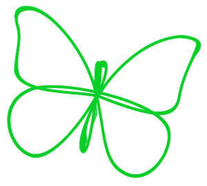
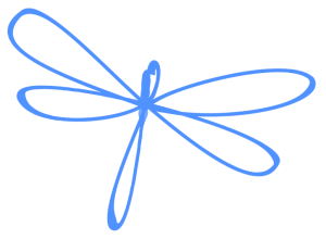
I have been meaning to write this post for a while as I wanted to explain the significance behind the butterfly and dragonfly used in the logo for this site.
 Firstly, the butterfly represents Henry. Shortly after Henry was discharged a lot of neonatal units, including ours, adopted the butterfly symbol to indicate a surviving twin. If staff or other parents see the butterfly emblem on an incubator they would know that baby was a survivor from a multiple pregnancy. In addition to this, I have often likened Henry’s journey to that of a butterfly growing inside a cocoon, except Henry’s cocoon was see-through and made of plastic! It was a pretty amazing transformation from when he was born to the baby discharged four months later.
 The dragonfly represents Archie. A nurse from the bereavement team at the hospital gave us a beautiful book called Waterbugs and Dragonflies. It is a book designed to explain death to young children, you can read the story online here. It gives a lovely analogy of a waterbug’s transition into a dragonfly being similar to a person dying and going to an unknown place above. The metaphor resonated with me and so whenever I see a dragonfly, I think of Archie.
The colours? The colours in the logo are also symbolic; each of the boys were wearing woolen hats at the beginning to hold their ventilator tubes in place, Henry had a green hat and Archie had a blue one.
Just a short post this time, I’m hoping to get back into writing soon, although Henry keeps me very busy now-a-days!
